COLOR THEORY
Color and light
Color is basically a matter of light. Without light there’s no color. White light contains all the visible spectrum colors. It means that these colors together, with the same intensities, make the white. The light from the sun, for example, is a white light. We can see that it’s made from all the colors in the rainbow, when the sunlight is decomposed.
Take a look how the light and colors work:
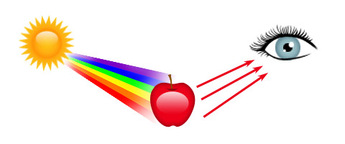
- The white light from the sun reaches the object.
- All the colors are absorbed, except the red.
- The red is the color that we see.
Take a look how the light and colors work:
- The white light from the sun reaches the object.
- All the colors are absorbed, except the red.
- The red is the color that we see.
Hue, Saturation and Brightness
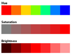
There are three main characteristics that can define color: Hue, Saturation and Brightness.
- The hue is the color itself, as you can see the variations in the image below.
- The saturation refers to the amount of color that distances it from the gray (a grayscale image, for example, is fully unsaturated).
- The brightness refers to the amount of black or white in the color. This is how the HSB system works, based on these values to create any color.
Additive and subtractive colors
We can work with these two color models, each one, for its own purposes.
The additive model is based on mixing the light, while the subtractive model is based on mixing the pigments. In a simple way, we work with the additive model (RGB) when preparing contents to be displayed on tv, internet, mobile or any light source. When working for printing, we work with the subtractive model (CMYK).
The additive model is based on mixing the light, while the subtractive model is based on mixing the pigments. In a simple way, we work with the additive model (RGB) when preparing contents to be displayed on tv, internet, mobile or any light source. When working for printing, we work with the subtractive model (CMYK).
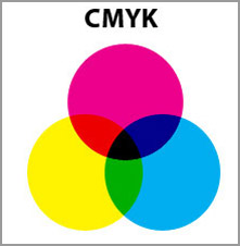
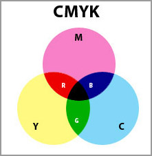
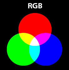
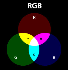
Notice something interesting: the mixing of RGB creates CMY colors, while the mixing of CMY creates RGB colors. And again, the mixing of light colors creates white and the mixing of pigment colors create black.
Color wheel
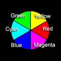
The standard color wheel is the key to understanding colors.
Red, green and blue are primary colors, and yellow, magenta, and cyan are considered secondary colors. If you take the time to memorize the color wheel on the left, you will find it useful in many areas.
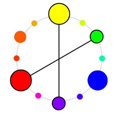
If any two colors exactly opposite each other on the color wheel are mixed, the result is white. Note that instead of canceling each other as they did with subtractive colors, these complementary colors combine for an additive effect. (One definition of complementary is "to make whole.")
Red, green and blue are primary colors, and yellow, magenta, and cyan are considered secondary colors. If you take the time to memorize the color wheel on the left, you will find it useful in many areas.
If any two colors exactly opposite each other on the color wheel are mixed, the result is white. Note that instead of canceling each other as they did with subtractive colors, these complementary colors combine for an additive effect. (One definition of complementary is "to make whole.")
Color harmonies
Let’s see some of the combinations that we call harmonies. They tend to compose a good combination, but, of course, any project has its particularities.
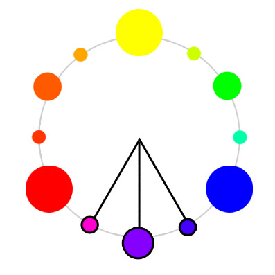
Complementary Colors
The complementary color makes a high contrast layout.
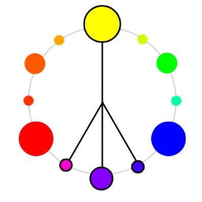
Double complementary also should be used.
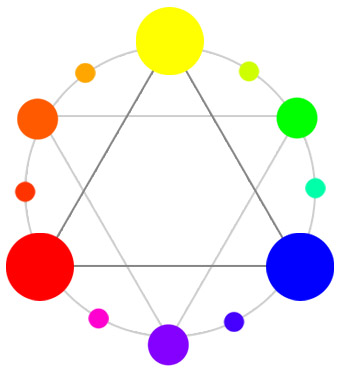
Analogous
The analogous harmony has a low contrast and makes a softer pallete.
You can also combine analogous with complementary.
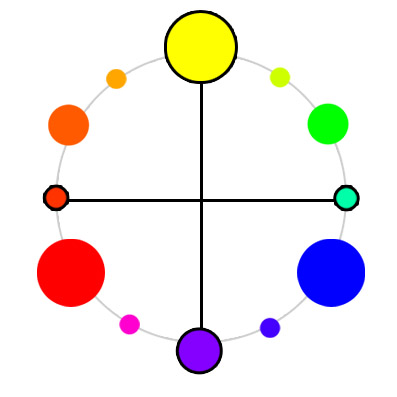
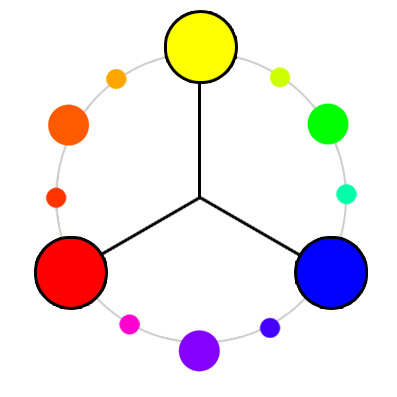
You can also choose tetrad or triad from the color wheel.
Complementary Colors
The complementary color makes a high contrast layout.
Double complementary also should be used.
Analogous
The analogous harmony has a low contrast and makes a softer pallete.
You can also combine analogous with complementary.
You can also choose tetrad or triad from the color wheel.
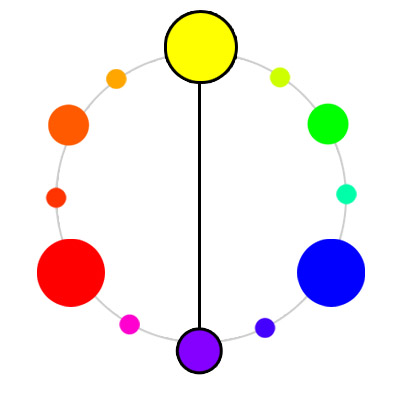
Warm and cold colors
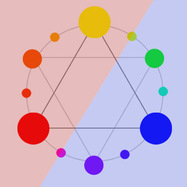
We can separate colors in warm and cool. The warm colors are the ones close to orange, red and yellow. The cool ones are next to blue, violet and green. The image shows the “line” between them. Adding warm colors make the layout more cozy, happy and vibrant, while using cool colors make it more cold, serious and formal.
COLOR IN ART DIRECTION
The function of color and texture
In addition to architectural elements and set decoration, production designers rely on color, tone and texture to help realize their vision.
- Colors and characters: Often the main characters in a script are assigned color and fabric palettes. When choosing a palette, designers consider the characters’ emotional journey as well as their social and cultural background. The chosen colors may show up in the characters’ costumes, in the props they use, or in the décor of their habitat.
- Colors as symbols: Colors can have culturally specific symbolic meaning. In Western cultures, for example, red usually denotes danger; white denotes purity. In the Chinese culture, white is the color of death, and red signifies happiness and health.
- Colors and emotions: Colors can hint at the emotions or states of mind of a character.
- Color tones and shading: are also important in art direction. Saturated, deep colors convey a sense of seriousness and intensity, while bright colors suggest lightness and delicacy. Black-and-white photography reproduces the world exclusively in tones of black, gray and white. Therefore, a production designer working on a black-and-white film must be aware of how the colors of his or her set are going to translate into those tones.
- The texture of a wall, prop, furniture piece or costume is another tool of the production designer. Along with color, the choice of materials can add to the overall design concept.
Different modes of using colors
Richard Misek, in his book Chromatic Cinema - A History of Screen Color (Viley-Blackwel, 2010) talks about 5 different modes of using color in film.
- Film color is color applied onto film prints. In early cinema, color took the form of pigments or dyes added to the surface of black-and-white prints by methods including hand painting, stencilling, tinting, and toning.
- Surface color is color reflected off surfaces in front of the camera. In classical Hollywood, color was “naturalized”; it became incorporated into the cinematographic process, no longer occupying the surface of the film but surfaces within the film. From the 1930s to the 1960s and beyond, film-makers typically explored color by placing colored surfaces in front of the camera, in the form of colored sets, costumes, make-up, and props. Consequently, as Jacques Aumont notes, color became the domain of the art department.
- Absent color is black-and-white. Though its presence extends across screen history, black-and-white has ironically become especially noticeable since (and because of) its marginalization by color; it is now prominent as an absence of color.
- Optical color is color as light. It involves the decomposition of white light into colored light by means of filtration, and is the domain of the cinematographer. Optical color developed parallel to, and in tension with, surface color; it never quite displaced surface color, but it did emerge as a significant tendency in post-classical cinema, especially between the 1970s and the 1990s.
- Digital color is color as code. Closely associated with post-production, digital color variously augments and transforms the other color modes. More than any other mode, it exemplifies screen color’s variability and actualizes its instability.
